Publication Design: Blocks Magazine
Typography III 2024
The objective for this project was to make a strong and unified visual identity for a conceptual publication by designing a unique wordmark, a polished visual system, a striking cover, an organized table of contents, and fully developed layouts for both a feature article and an interview


Wordmark Iterations and Process
I wanted my wordmark to visually represent the physical and mental roadblocks that individuals face when experiencing homelessness. The heavy, structured typography reflects the weight and immovability of these challenges. Integrated into the design is a subtle street map element, symbolizing both the idea of a "street block" and the neighborhoods where these issues unfold. This connection serves as a reminder that homelessness is a local issue and one that neighbors and communities have the power and responsibility to address with empathy and action.
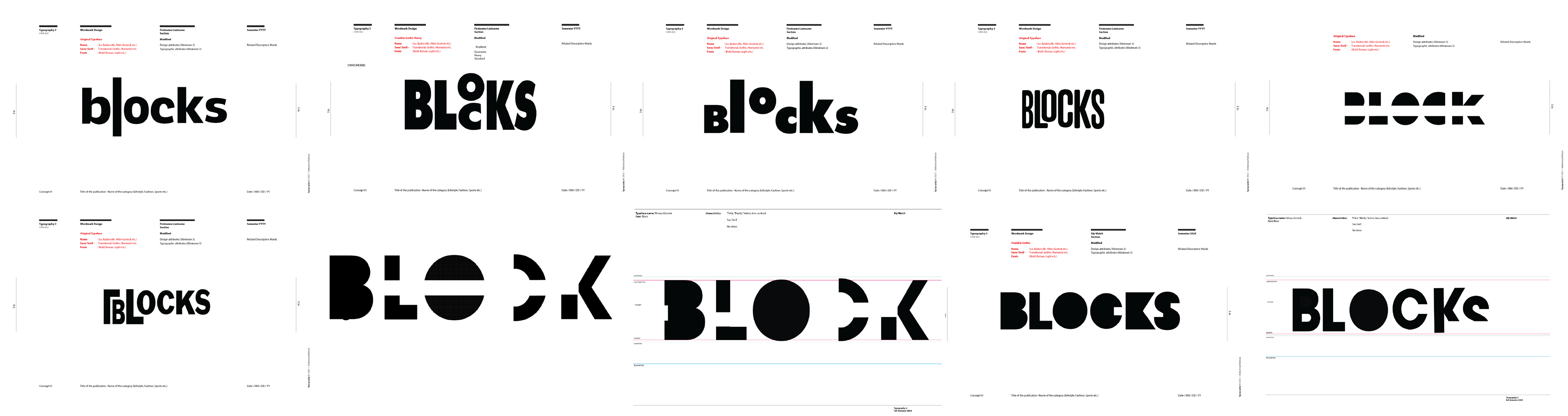
Wordmark Final

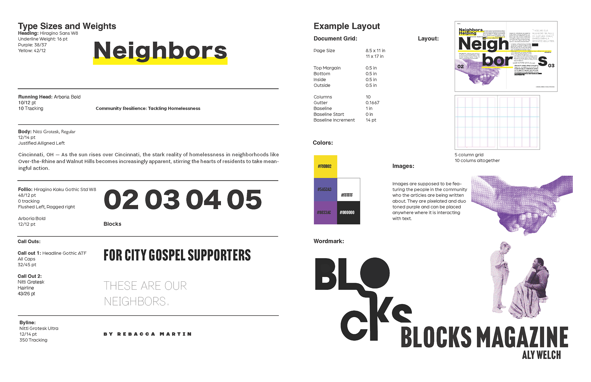
Visual System
A magazine visual system for BLOCKS, identifying a guideline designers must follow to stay within the visual identity of the magazine
Final Spreads
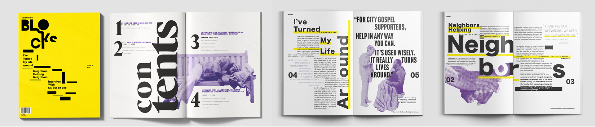
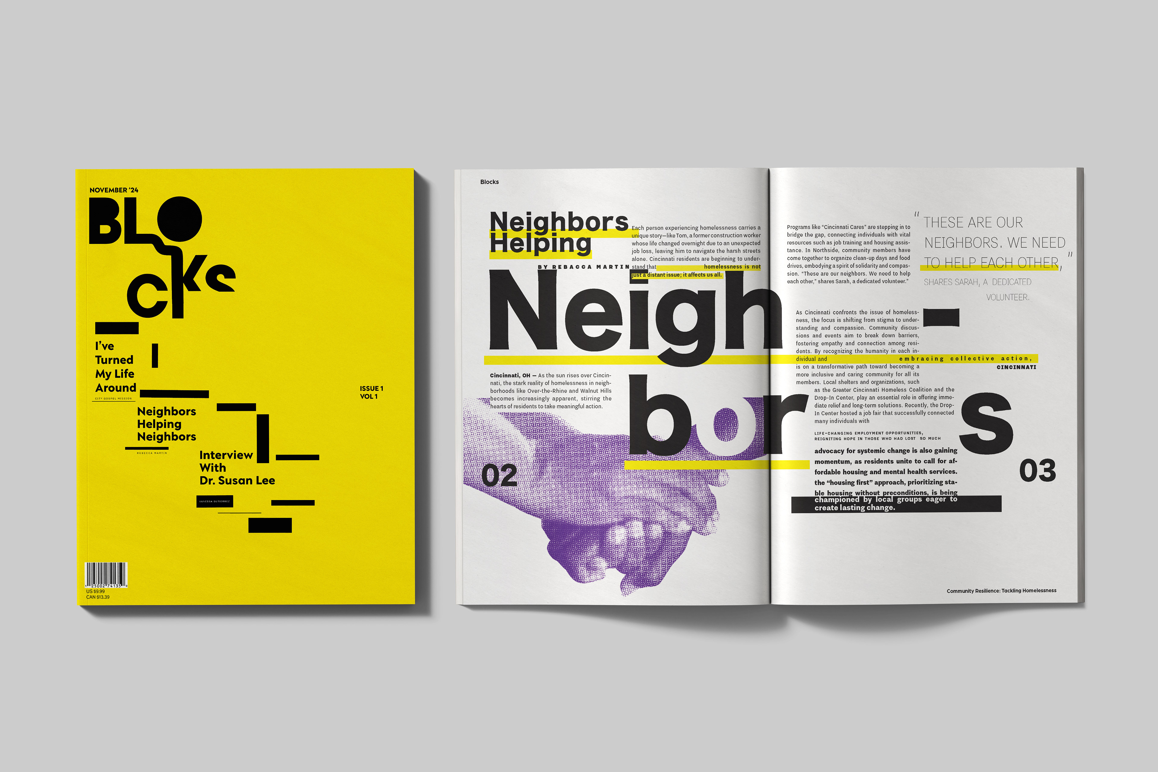
The final issue of Blocks presents a bold cover with the custom wordmark and a table of contents outlining future content. Though only the feature and interview articles are complete, each spread reflects the magazine’s visual identity and mission to highlight the barriers of homelessness and the role of community support.