MARKETLINE
App Design UX/UI
Interaction Design I 2025
By designing a mobile app that focuses on usability, local transparency, and community-driven design, Market Line aims to enhance access to fresh food for busy or urban residents. The app will build trust between buyers and vendors, streamline the market experience, and increase sales for local farmers and artisans. A user-friendly platform will help foster community, support small businesses, and reduce friction in the local food supply chain.
Overview
Market Line is created to connect pressed for time consumers with the fresh produce and handmade goods found at their local farmers market. Whether someone can’t make it in person, doesn’t have a car, or prefers to shop from their phone, Market Line brings the market to them live, in real time, with local delivery.
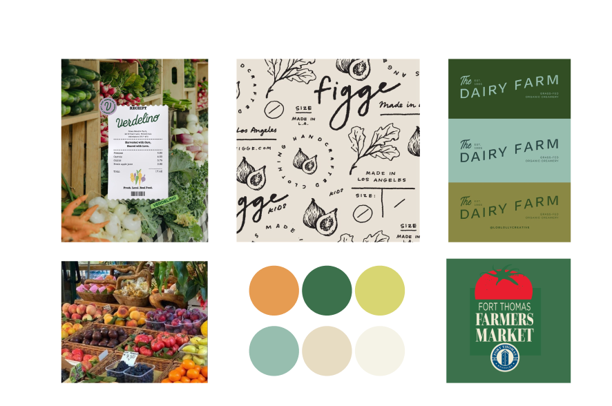
Mood board & inspiration
For the color palette, I chose shades of green, blue, and beige to strike a balance between modern and organic. The greens naturally evoke freshness and tie back to the farm-to-table concept, while soft blues add a clean, calming tone that feels contemporary.
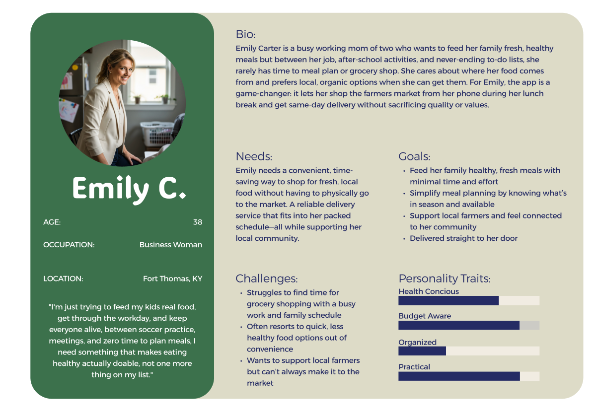
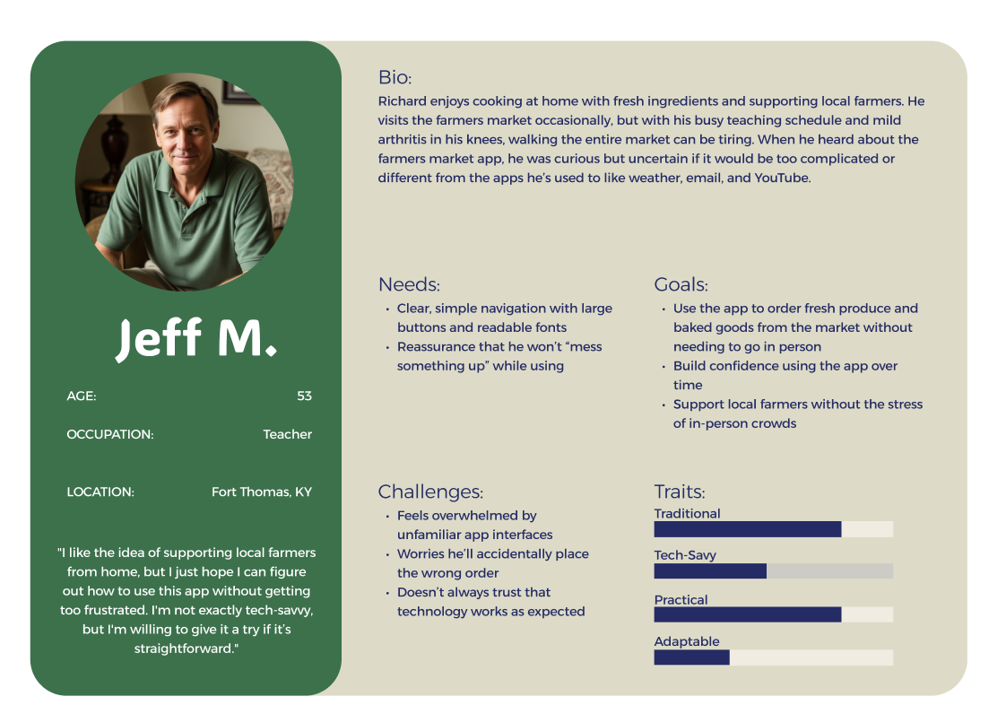
Personas
Emily is a busy mom who works a full time job and never goes to the Farmer’s Market due to the hours always being when she’s at work. She cares about her kids getting healthy meals and fresh ingredients but she simply doesn’t have time to get them from the market and struggles to find good ingredients at a regular grocery store.
Jeff M. is a proud supporter of his local Farmer’s Market. However, when he is in the classroom during the school year it makes it more difficult for him to attend the Market and get his groceries for the week. He also is having issues with his knees as he is getting older and walking around the Market every week isn’t ideal for him. He is open minded to using an app for delivery but isn’t very tech savy and is nervous he won’t be able to successfully use it.
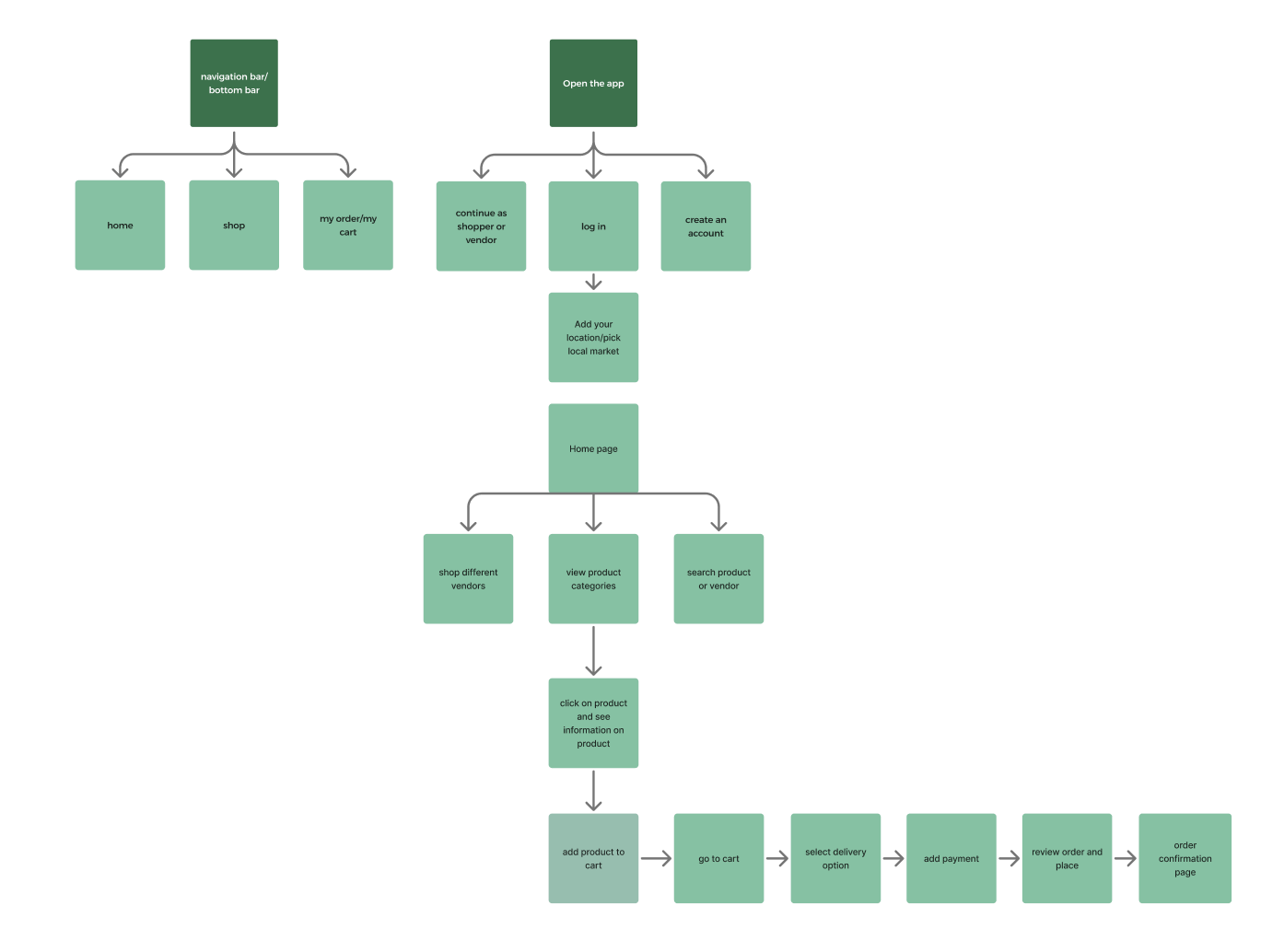
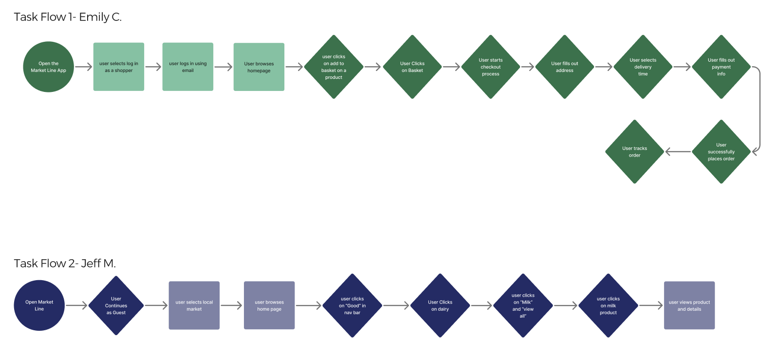
Task Flows & IA Pattern
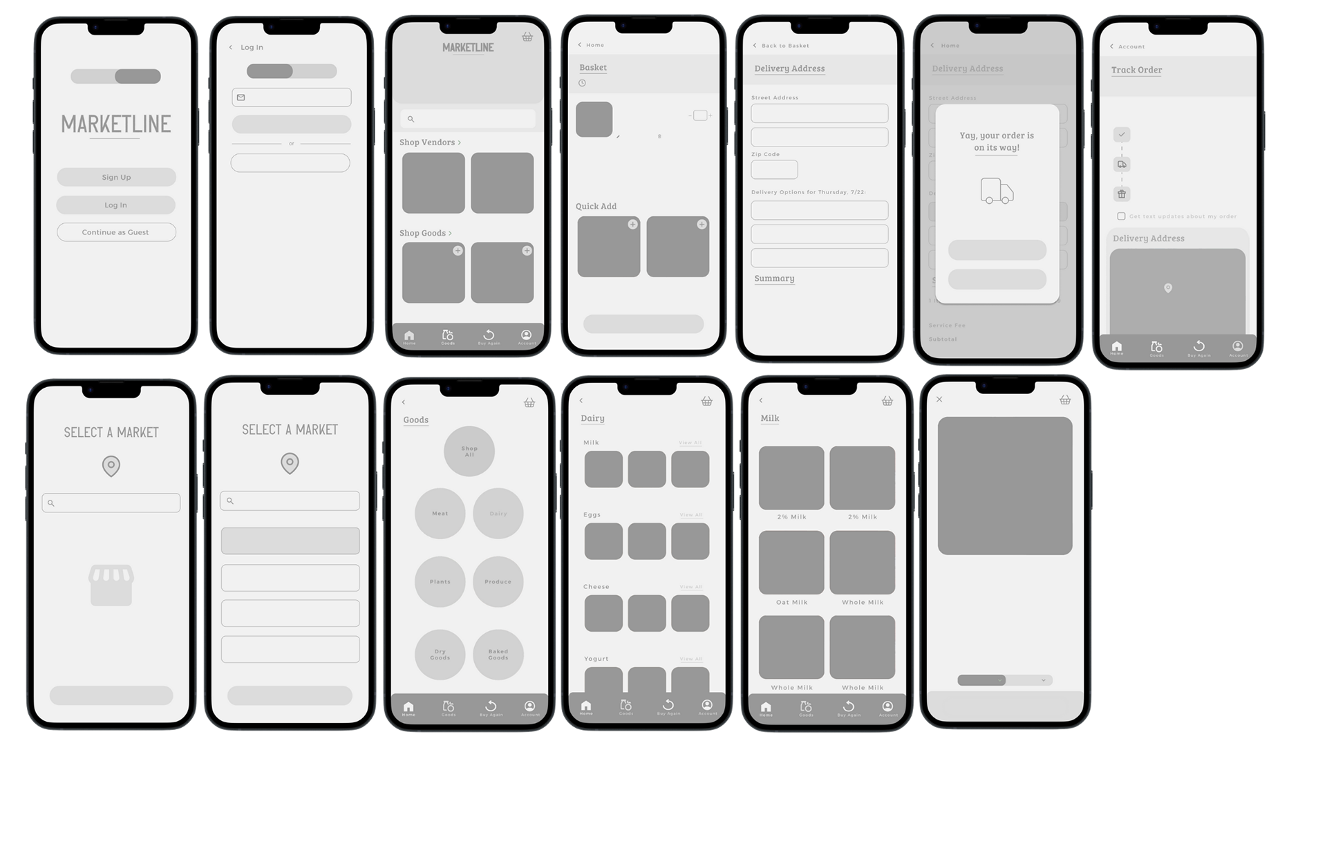
Lo/Mid-Fi Wireframes
In the initial wire framing stage, I really wanted to focus on the features and screens that felt essential to the core user experience. My goal during sketching was to map out the primary user flows first such as browsing the homepage, adding items to a cart, and a checkout process. Wire framing at this stage allowed me to refine the app’s structure before diving into detailed mockups.
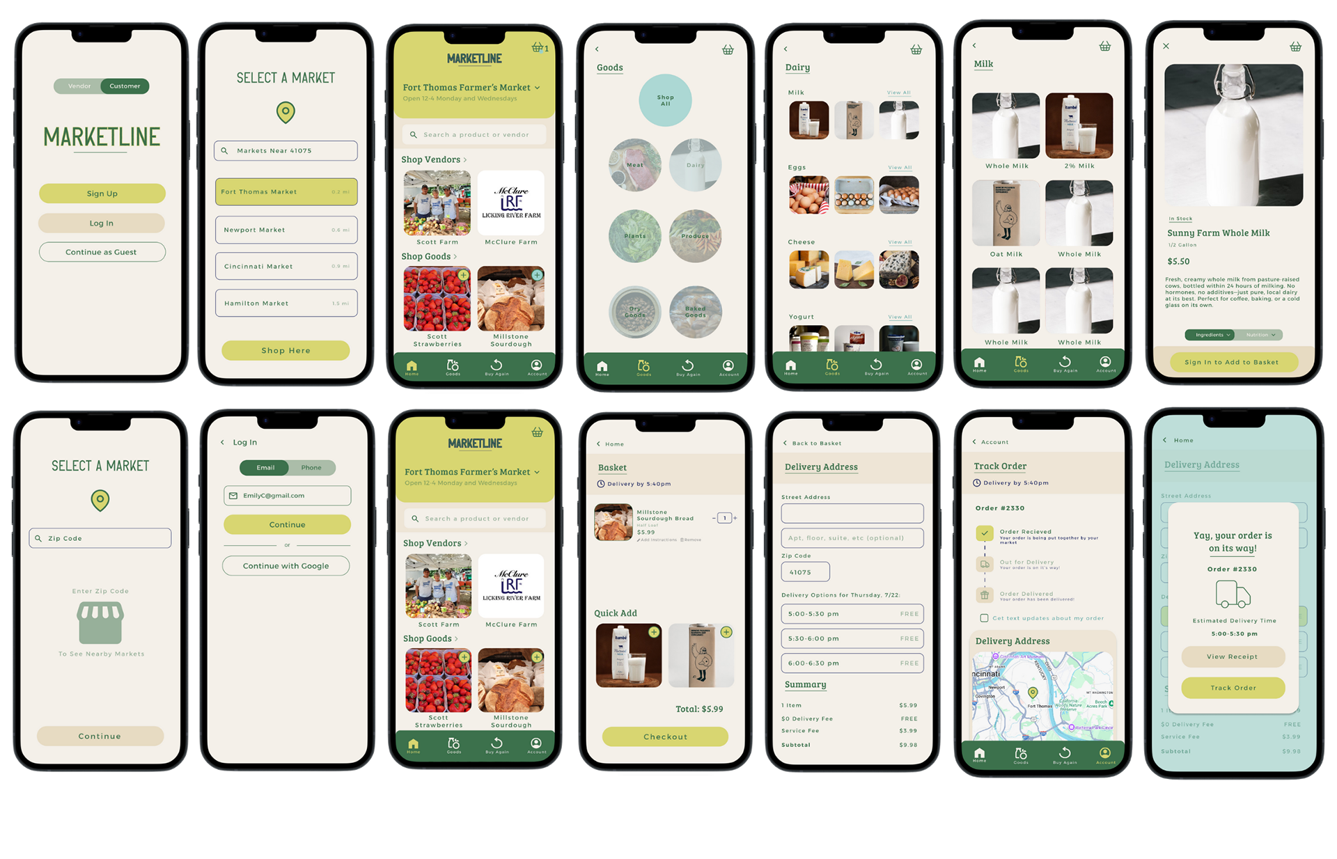
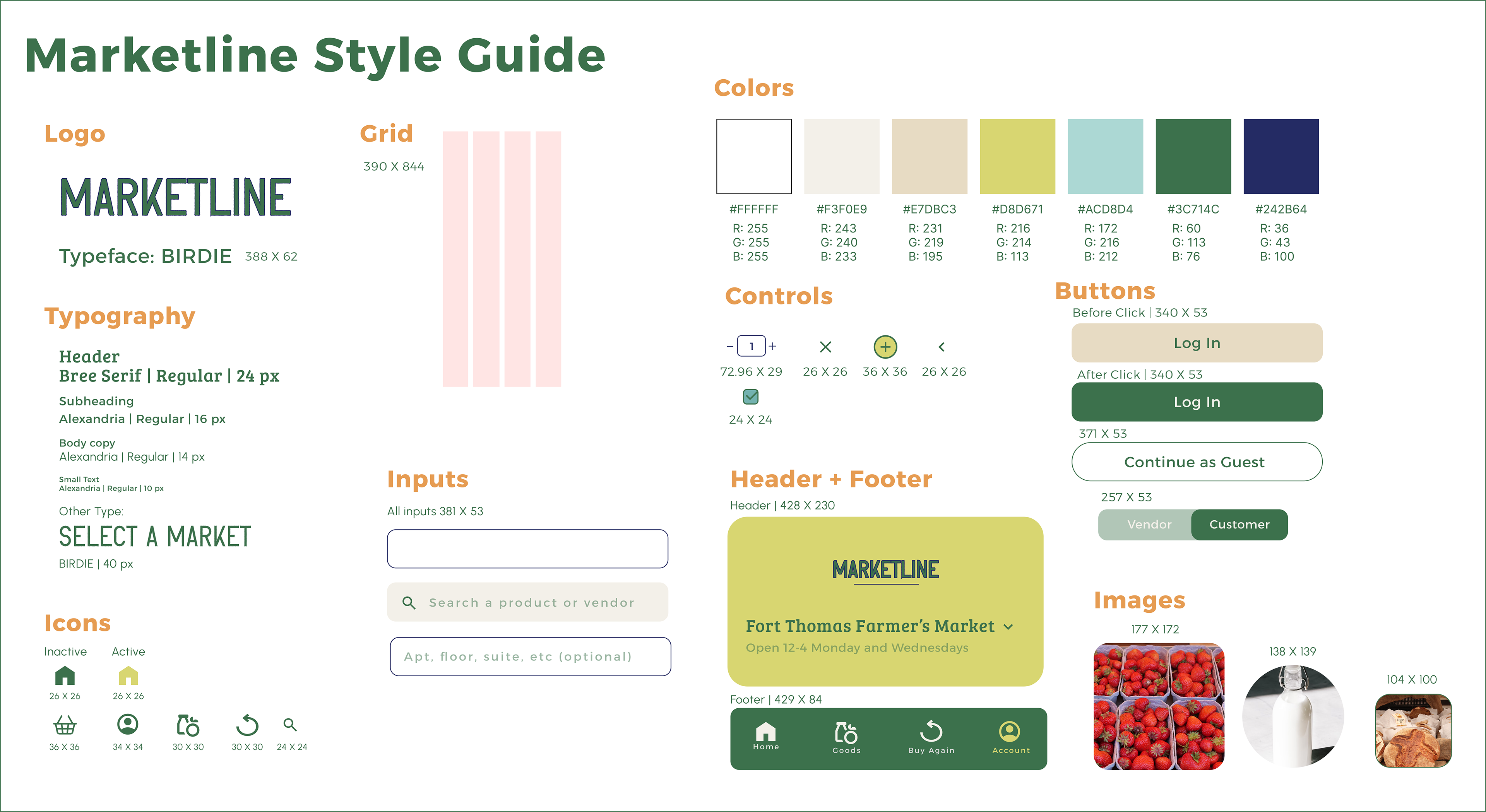
Final Screens & Walkthrough
After much exploration, the final screens and style guide were developed. I refined the visual hierarchy to create a clearer, more intuitive flow, and updated the background to a light blue to give the interface a cleaner, more modern feel. These changes helped improve readability, reduce visual clutter, and tie the overall design together.